Customize the appearance and behavior of your maps to match your website’s design and user experience goals.
Map Dimensions
Map Height
Control the vertical size of your map:
- Default: 400px
- Units: px, %, vh, em
- Responsive: Use % or vh for responsive heights
Height: 500px (Fixed)
Height: 100vh (Full viewport height)
Height: 50% (Half of container)
Map Width
Set to 100% by default to fill the column width. Can be customized using Elementor’s width controls.
Zoom Settings
Default Zoom Level
Set the initial zoom when the map loads:
- 1-3: World/continent level
- 4-6: Country level
- 7-10: Region/state level
- 11-14: City level (default: 13)
- 15-18: Street level
- 19: Building level (max)
Zoom Controls
Enable or disable zoom in/out buttons:
- Enabled (default): Shows +/- buttons
- Disabled: Zoom only via scroll wheel
Scroll Wheel Zoom
Control whether users can zoom with mouse wheel:
- Enabled: Scroll to zoom
- Disabled (recommended for embedded maps): Prevents accidental zooming while scrolling page
Marker Clustering
When displaying many locations, clustering groups nearby markers for better performance and UX.
Enable Clustering
Toggle on to activate marker clustering:
- Markers close together are grouped into clusters
- Cluster shows the number of markers it contains
- Click cluster to zoom in and reveal individual markers
- Improves performance with 50+ markers
Cluster Radius
Distance in pixels within which markers are clustered:
- Default: 80px
- Smaller (40-60px): More individual markers visible
- Larger (100-150px): More aggressive clustering
Map Controls
Fullscreen Control
Add a button to expand map to fullscreen:
- Button appears in top-right corner
- Useful for maps with many locations
- Exit fullscreen with ESC key or button click
Locate Control
Add a “Find My Location” button:
- Centers map on user’s current location
- Requires HTTPS
- User must grant location permission
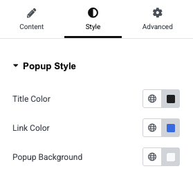
Popup Style Controls
Customize the appearance of marker popups using the Style tab in the widget settings:
Title Color
Set the color for popup titles.
- Default:
#222222(dark gray) - Click the color picker to choose a custom color
Link Color
Set the color for links within popups.
- Default:
#1a73e8(blue) - Applies to “View More” links and other clickable elements
Popup Background
Set the background color for the entire popup.
- Default:
#f9fafb(light gray) - Choose colors that complement your site design
Custom CSS Styling
Advanced users can add custom CSS to style map elements:
Popup Styling Example
/* Custom popup styles */
.leaflet-popup-content-wrapper {
    background: #2c3e50;
    color: #fff;
    border-radius: 8px;
}

.leaflet-popup-content h3 {
    color: #3498db;
    margin-bottom: 10px;
}
Marker Styling Example
/* Custom marker shadows */
.leaflet-marker-shadow {
    opacity: 0.5;
}

/* Hide attribution (not recommended) */
.leaflet-control-attribution {
    display: none;
}
Sales
Lorem ipsum dolor sit amet, consectetur adipiscing elit. Ut elit tellus, luctus nec ullamcorper mattis, pulvinar dapibus leo.

Help & support
Lorem ipsum dolor sit amet, consectetur adipiscing elit. Ut elit tellus, luctus nec ullamcorper mattis, pulvinar dapibus leo.

Article & News
Lorem ipsum dolor sit amet, consectetur adipiscing elit. Ut elit tellus, luctus nec ullamcorper mattis, pulvinar dapibus leo.